Cybersecurity

Company Overview

Forcepoint is a cybersecurity company that provides both perimeter protection and behavioral analytics. Growing through acquisitions, they are developing a new platform to provide their services in the cloud.

Project Goals

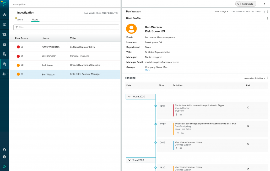
A design an application that allows analysts to identify and investigate risky users.

Tasks

  • Create Initial Design
  • Research User Needs
  • Refine Design

Detailed Timeline of Process

A deep dive into my design process.

  • Interactive (requires free Figma account)
  • PDF (large file, may be slow to open)

Create Initial Design

The target audience for this application is analysts.  Their job is to identify and investigate risky users on a company’s computer network. Since the analysts can get bombarded with hundreds of alerts a day, this application uses machine learning to call out the riskiest users. Then the analysts explore a dashboard and drill down to learn more about risky users.

I wanted to understand the typical task flow analysts follow as they investigated a user so the application would display the features and data they needed when they needed it.

To begin, I reviewed the user personas, use cases, and product requirements with the product owner. From that, I created an initial interactive prototype with Sketch & InVision.

Research User Needs

Then I interviewed almost two dozen subject matter experts around the company: analysts, product & project managers, sale engineers, and professional services. Many of these people had worked with customers on a regular basis for years. I also was able to review interviews I had with customers who were analysts.

During the interviews, I demonstrated the task flow and layout with an interactive prototype. Then we went back screen-by-screen for feedback. I created seven iterations over six weeks. We worked through six areas of decision points.

Refine Design

I noticed a pattern in preferences: power users vs. those new to cybersecurity. When I discussed this with the product owner & management, the decision was to favor the preferences of those new to cybersecurity since they made up a larger part of our target audience.

Decisions

  • Two tabs: allow more screen space for the timeline and the widgets.  Analysts did not need to look at both at the same time.
  • Profile data: keep at the top of the timeline since that was crucial to remember during an investigation.
  • Timeline order: reverse chronological, the current industry standard. Users could reverse the order.
  • Time: endpoint time since that was needed for law enforcement cases.
  • Metadata per activity: include for a richer scan even though fewer activities would appear above the fold.
  • Activity details: next to timeline rather than a modal to reduce clicks.

© Copyright - Ucentric Design - 2026 All rights reserved.
All materials on these pages are copyrighted. No part of these pages, either text or image may be used for any purpose.